BitTok serves as a reliable and consistent platform for cryptocurrency exchange, boasting a performance span of more than a year. I embarked on a visual upgrade in 2021 for this venture. Despite the app's operational steadiness, it falls short in setting a unique brand persona and design. For this, I propose improvements that focus on elements like color schemes, symbols, structural layouts, and all design aspects of the software, elevating the app to a better & professional look.
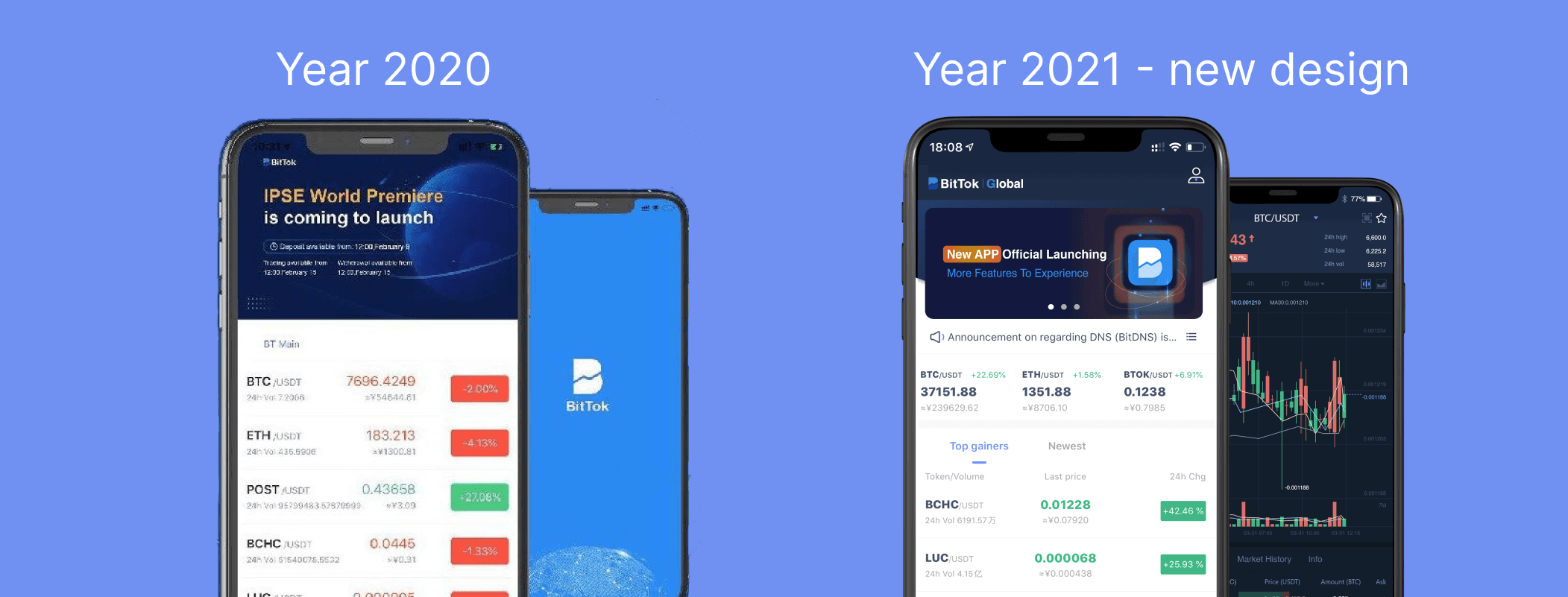
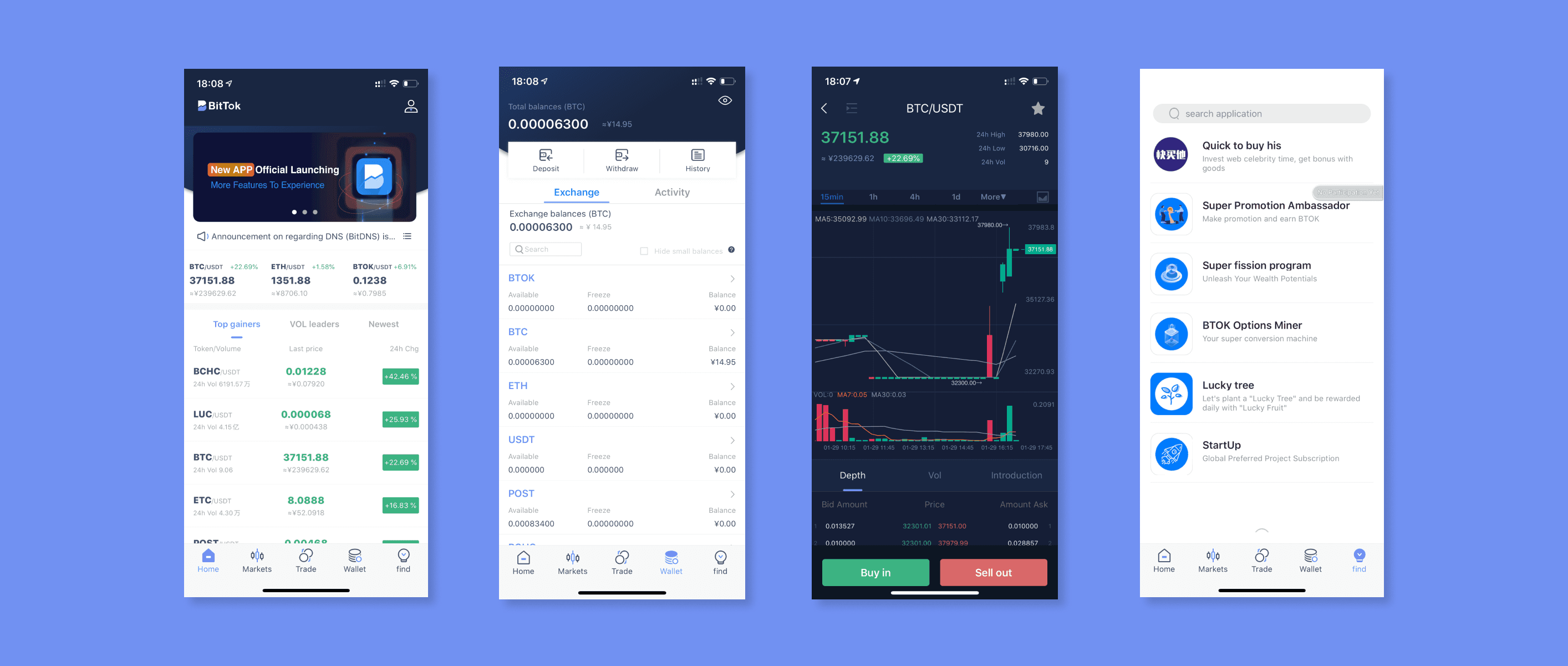
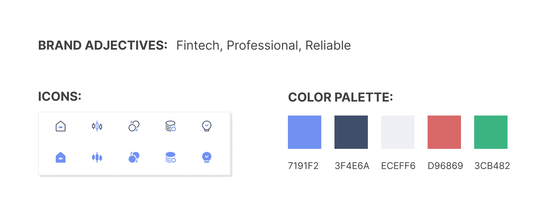
I've designed a UI kit that encapsulates the spirit of the Bittok identity, reflecting its unique traits. We've kept their signature blue hues, improving the overall layout to establish a more reputable and trustworthy platform.
Define Problems
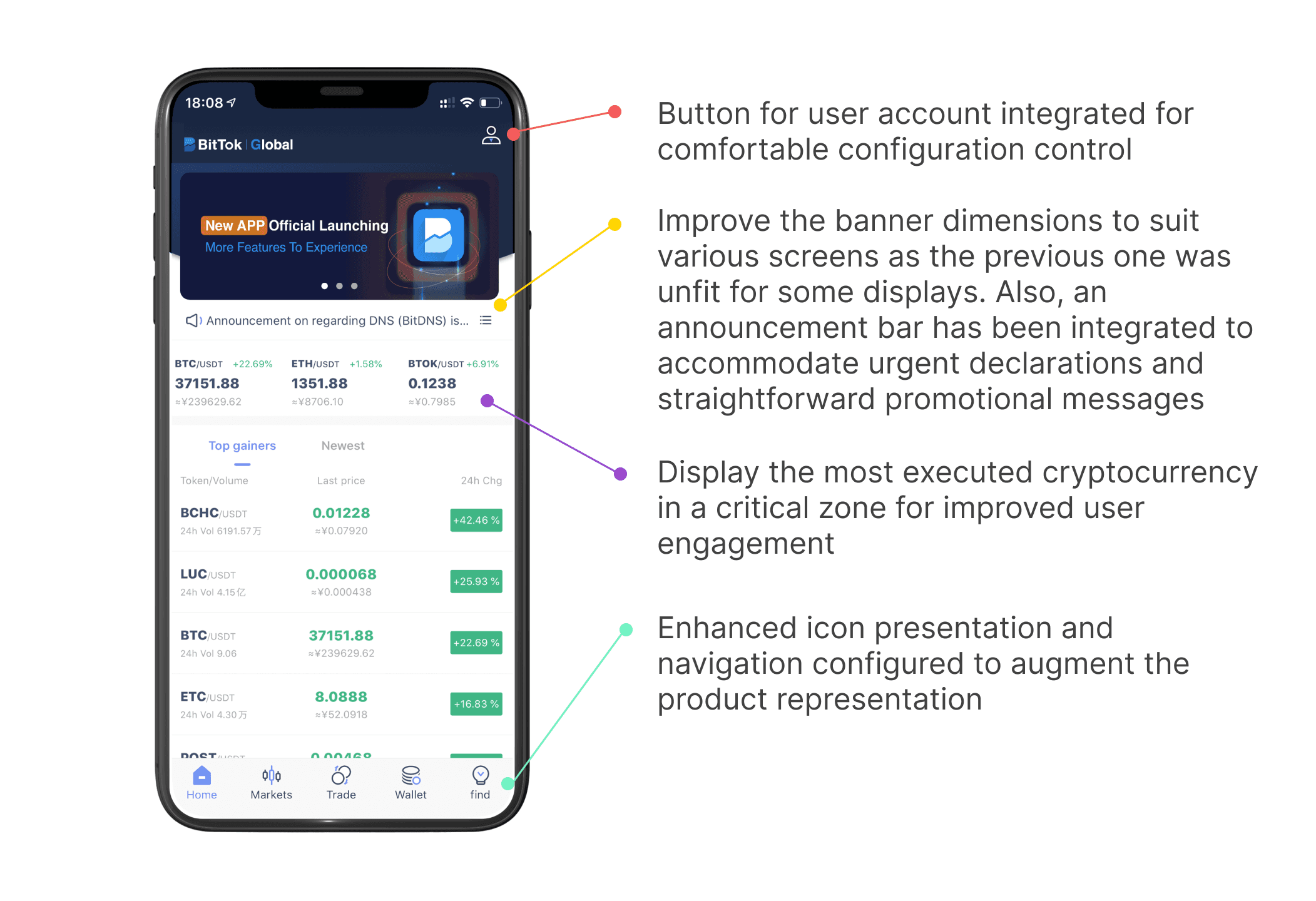
In response to genuine user feedback, I've identified a few issues with our current app thus formulating solutions tailored to their specific needs, not just revamping the UI. The primary objective lies in adopting a user-centric design strategy throughout the UI transformation journey.
The following example represents the primary solution for modifying the UI homepage.